Sustainable Materials Presentation
Going beyond specs to help brands navigate the materials phase of a sustainable packaging project.
ART DIRECTOR • DESIGNER • RESEARCHER
Opportunity
Guacamole Airplane is a design studio that’s focused on sustainable packaging. One of my first projects with them was redesigning the Material Review presentation that they show to clients. Materials dictate a lot about how packaging is engineered and designed, so this presentation comes before any in-depth design work. The goal of the presentation is to guide clients through many sustainability grey areas, and empower them with enough information to choose the best materials to meet their goals.
Execution
Choosing more sustainable materials means understanding their impact and implications throughout the entire supply chain. Supply chains are complex — none of it is cut-and-dry. On the contrary, choosing materials is all about navigating nuance and balancing tradeoffs.
This redesign started in spreadsheets. By refining the back end data, I could get a complete picture of all the information and start to parse it out. Not only that, it was much easier to scale the presentation when working from an up-to-date material database.
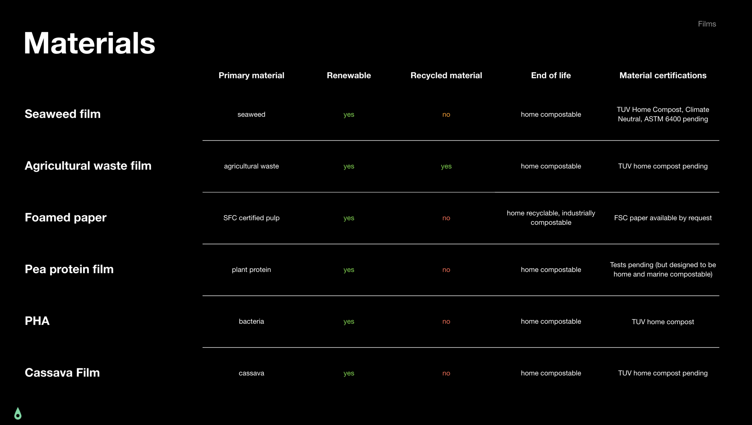
To navigate grey area, I start with comparison and context. For comparison, each material section starts with tables comparing similar attributes of all the material options in one place. Then, on each material’s spotlight slide, there was space for context.
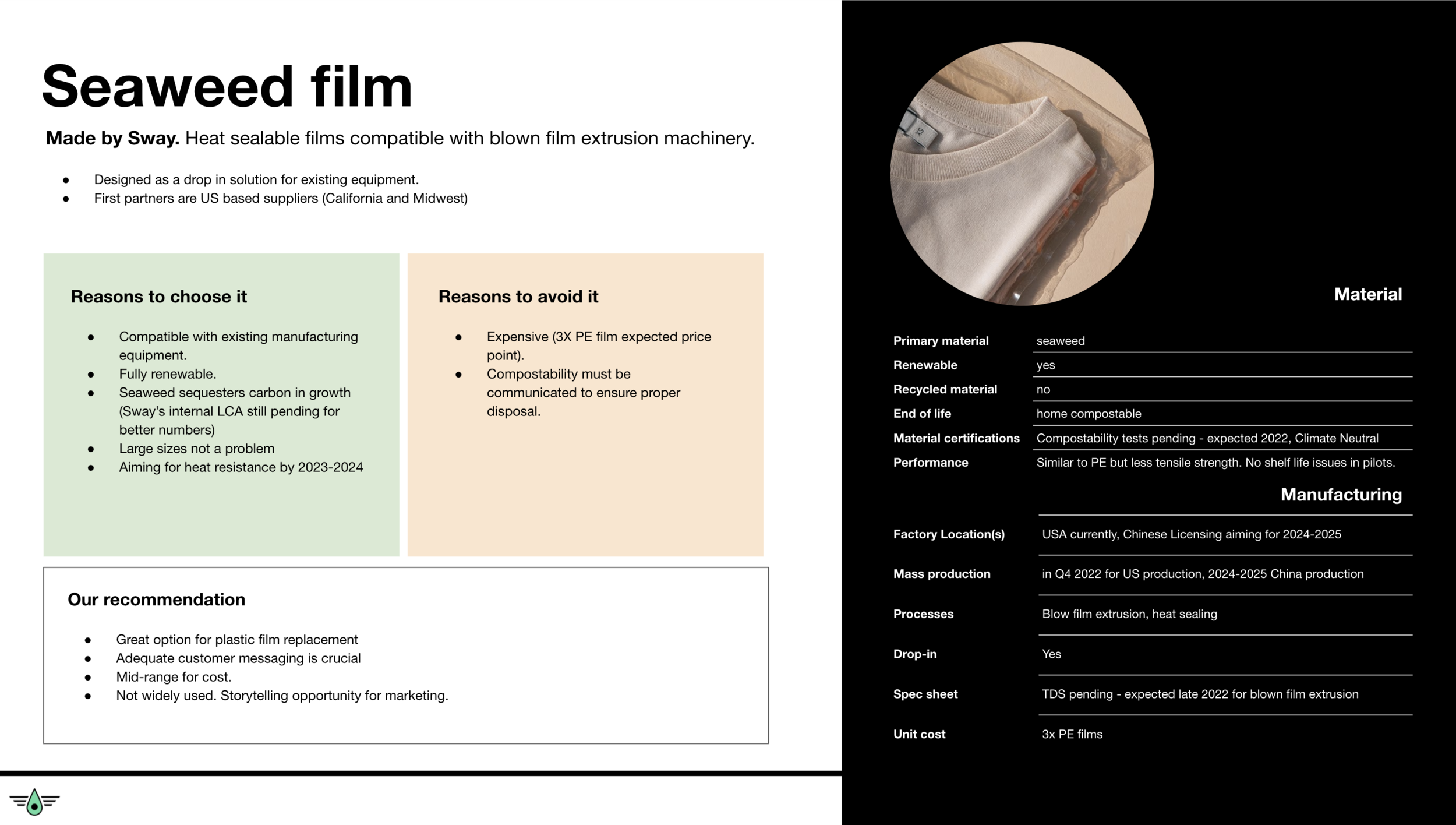
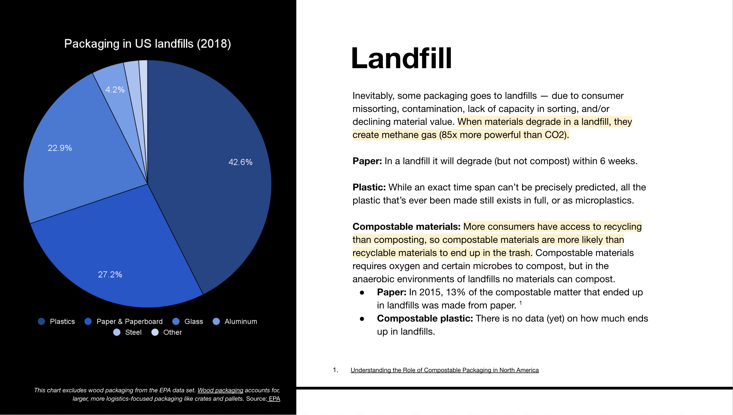
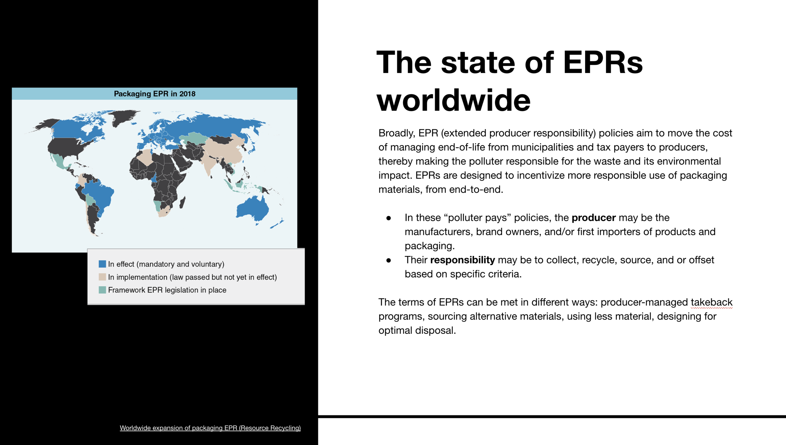
To avoid late-stage bottlenecks, each spotlight slide addressed common concerns and questions for each client stakeholder: designers, customer experience team, operations, and finance. In addition to the end-of-life options listed on each spotlight page, there is an entire End-of-life section dedicated to feasibility based on historical recovery rates.
Process
-
After collecting years of material information, there are bound to be some redundancies. I gathered and organized the specs and data to have a reputable base of information to work from.
-
With data and specs in place, it was time to start digesting information like for like. How does one material look or feel different from another? How is it best disposed? Is the ideal disposal method accessible to most customers?
I grouped each of these material attributes into categories: material, manufacturing, end-of-life. At the beginning of each section, information is grouped by these categories with tables to compare one material to another.
-
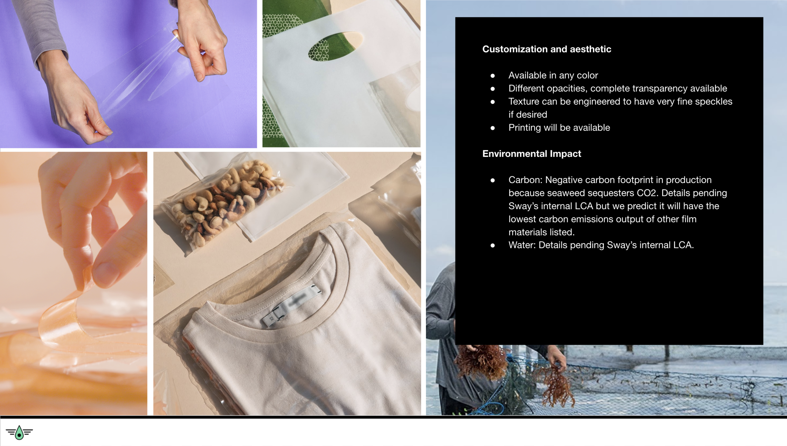
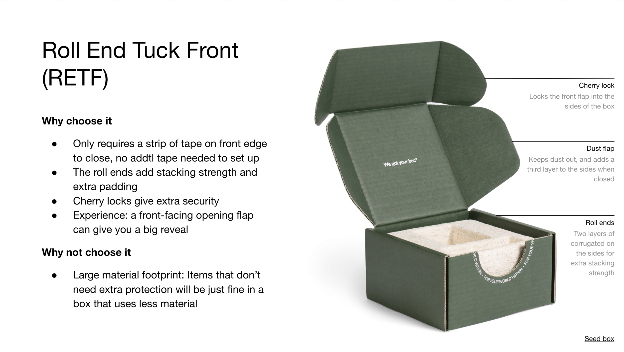
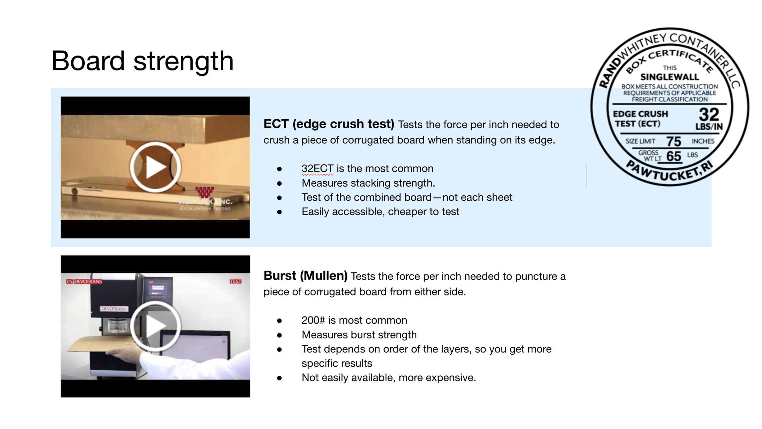
Each material has its own spotlight slide which leaves us space to add more context. This is the place for all the ifs, ands, and buts. In addition to a complete specs panel, we contextualize the pros and cons that are hidden between the lines of the specs. Each spotlight slide is followed with a gallery to show the material in its different forms and textures, with details about customization capabilities.
-
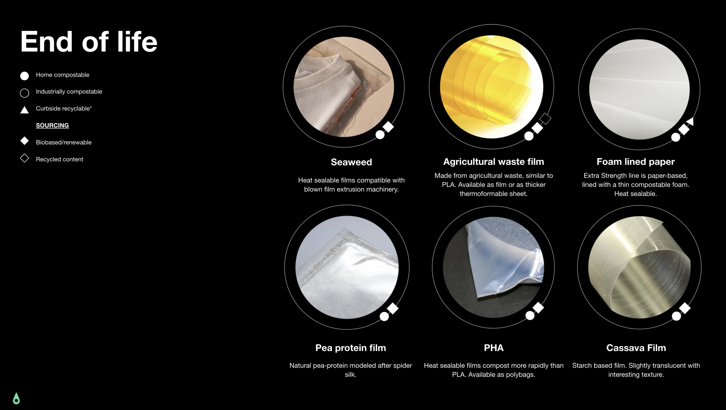
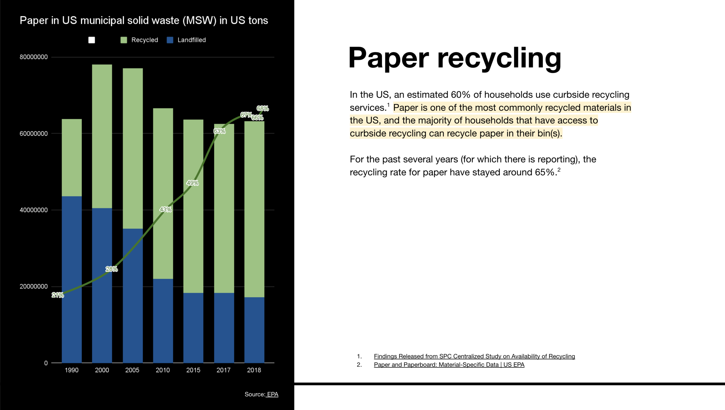
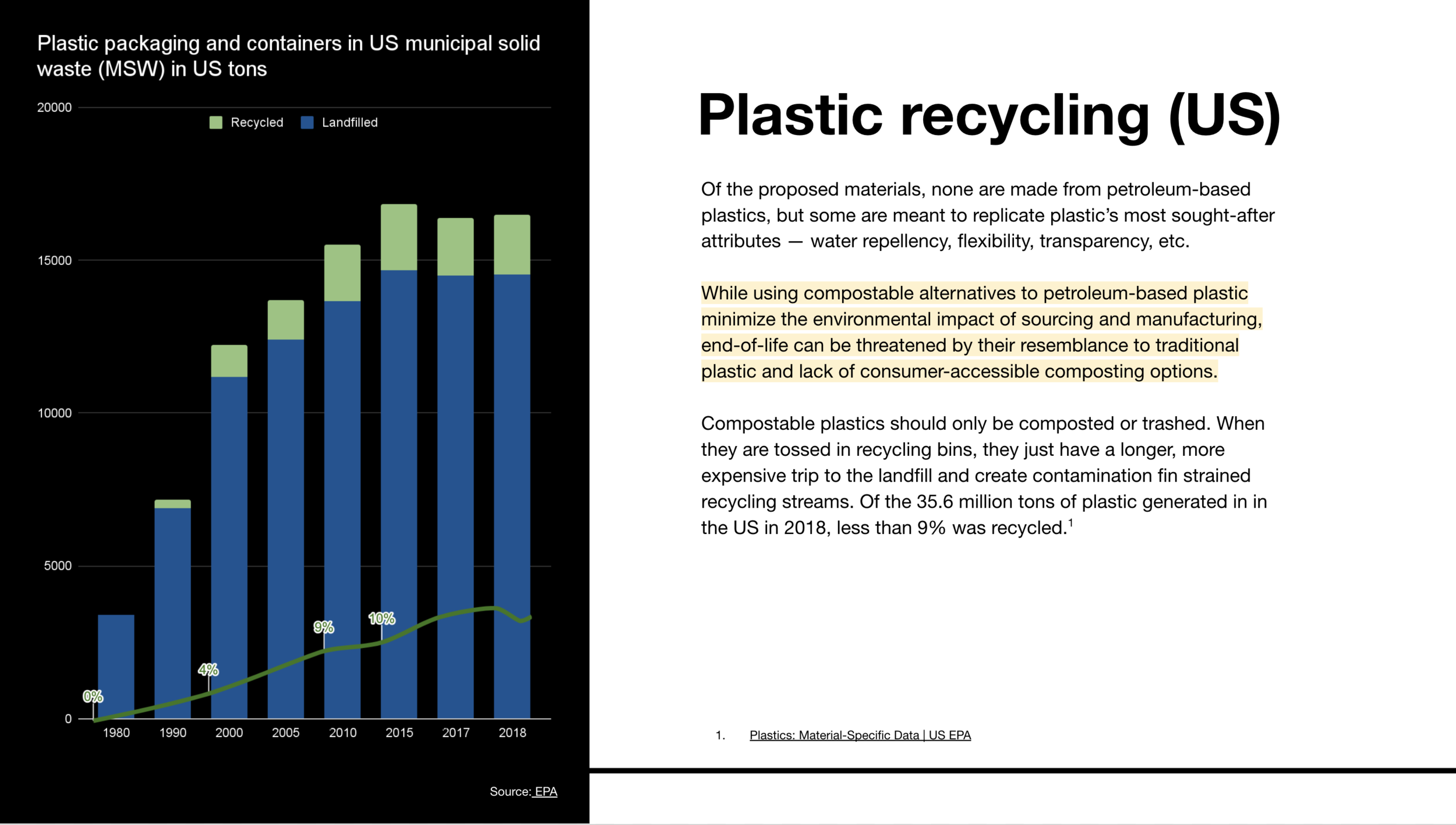
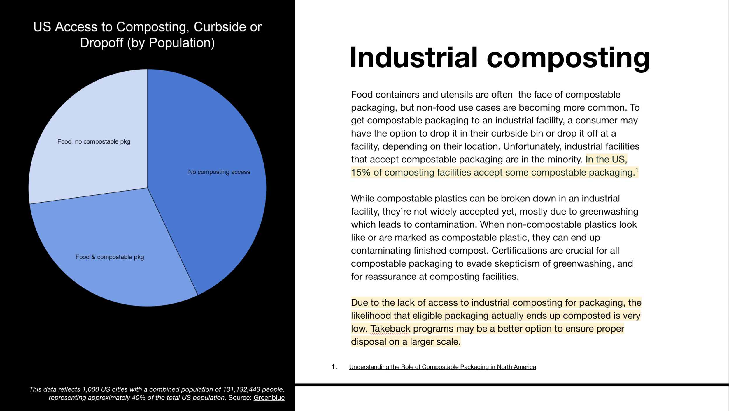
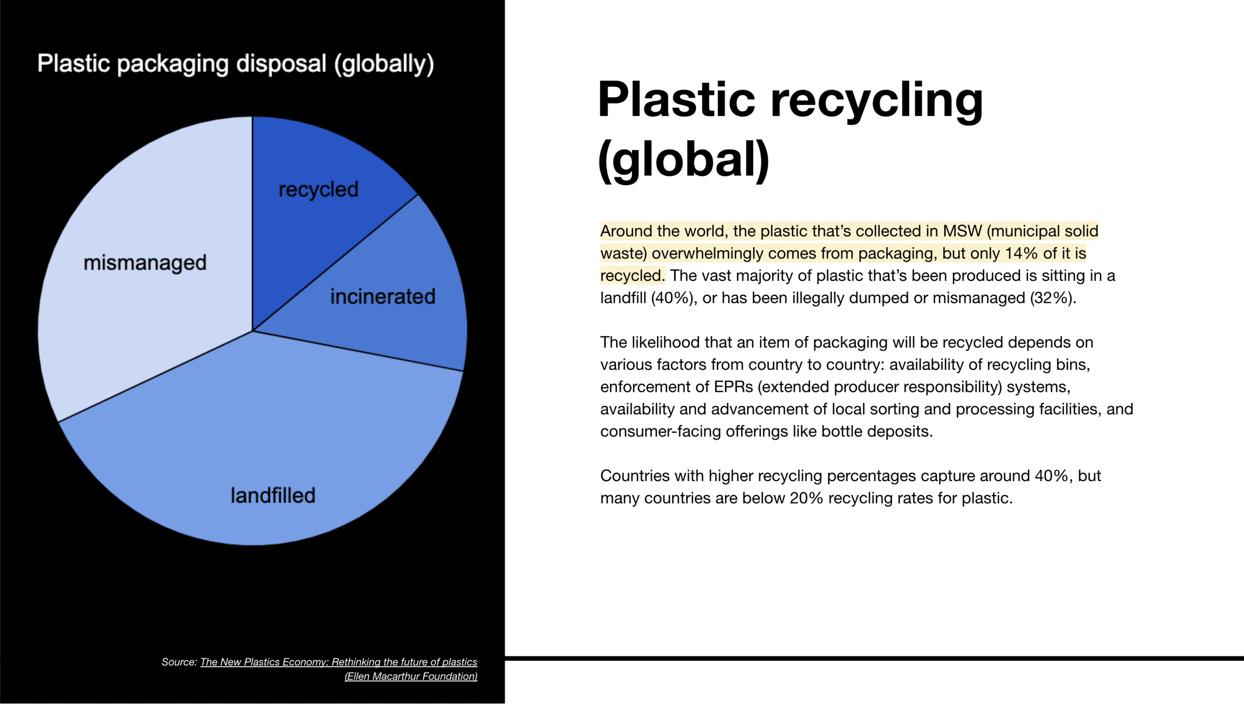
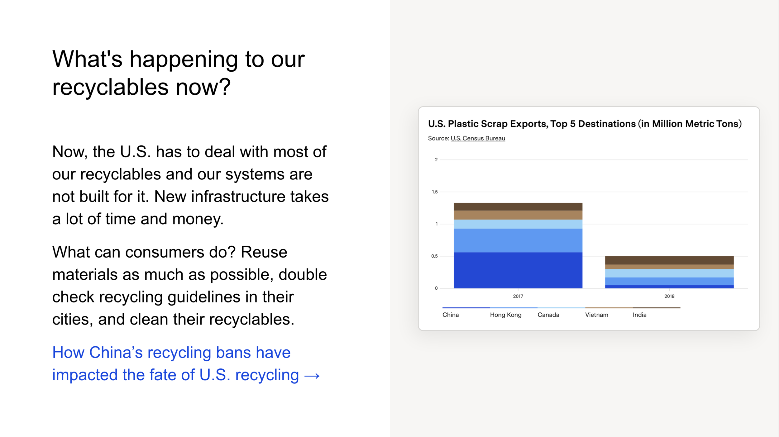
More and more, consumers want to do the right thing for their packaging and do the best they can to divert it from landfill. But even with the best of intentions, access to composting and recycling varies widely from city to city. The end-of-life section in the presentation provides a feasibility big picture so that clients can look through the lens of their customers around the world.
More projects
Packaging Training
Our team’s first formal training, giving new employees a primer on packaging manufacturing and sustainability.
PROJECT MANAGER • RESEARCHER • DESIGNER
Opportunity
Lumi is a platform for connecting businesses with packaging manufacturers. In order to build, market and sell the software, our team needed a base knowledge of packaging, manufacturing, and sustainability.
Without a shared knowledge base, new team members were learning on the go, asynchronously piecing together new information through Google and Slack.
Execution
I launched a cross-team collaboration to build our first packaging training — Lumi U. New employees got a comprehensive overview of printing and manufacturing, in addition to the sustainability implications of each packaging product. The goal was not only to teach new team members the base packaging info that they’d need for their role, but to hopefully pass along our enthusiasm and curiosity.
Over time, we continued to iterate and refine the training to optimize for a knowledge set that would be most useful across every role and team.
Process
-
For my first year or so at Lumi, I was learning new packaging information every day. Well, come to think of it, I’m not sure that ever changed, but as our team was growing month to month, it seemed necessary to consolidate all the information we’d learned so far into a common source of truth.
To build this packaging training, I brought on our merchandising designer Lauren Tom who was responsible for all of our product pages and had an intimate knowledge of specs and customer expectations. I also brought on our head of supply chain Daniel Binkoski who was responsible for growing our manufacturer network and had a comprehensive understanding of manufacturing capabilities.
The three of us built the teaching deck and we taught most of the early sessions. Over time, we brought in a team of 10 teachers to share the load and rotate sessions throughout the year.
-
As a 1-person content team, this was usually my motto. We had so much information in our product catalog along with a gallery of YouTube videos and internal manufacturer documents to learn from. So after starting with a loose outline, the beginning of the project was all about gathering, culling, and curating. Then we’d find the gaps that we had to fill out with more information.
-
Working from our beefy knowledge base, we deliberated over how best to design the information in a way that was digestible and memorable. It’s not likely that everyone was going to remember everything that was said. It was more important that they remembered the information existed. In other words, taking people from “what you don’t know you don’t know” to “what you don’t know”.
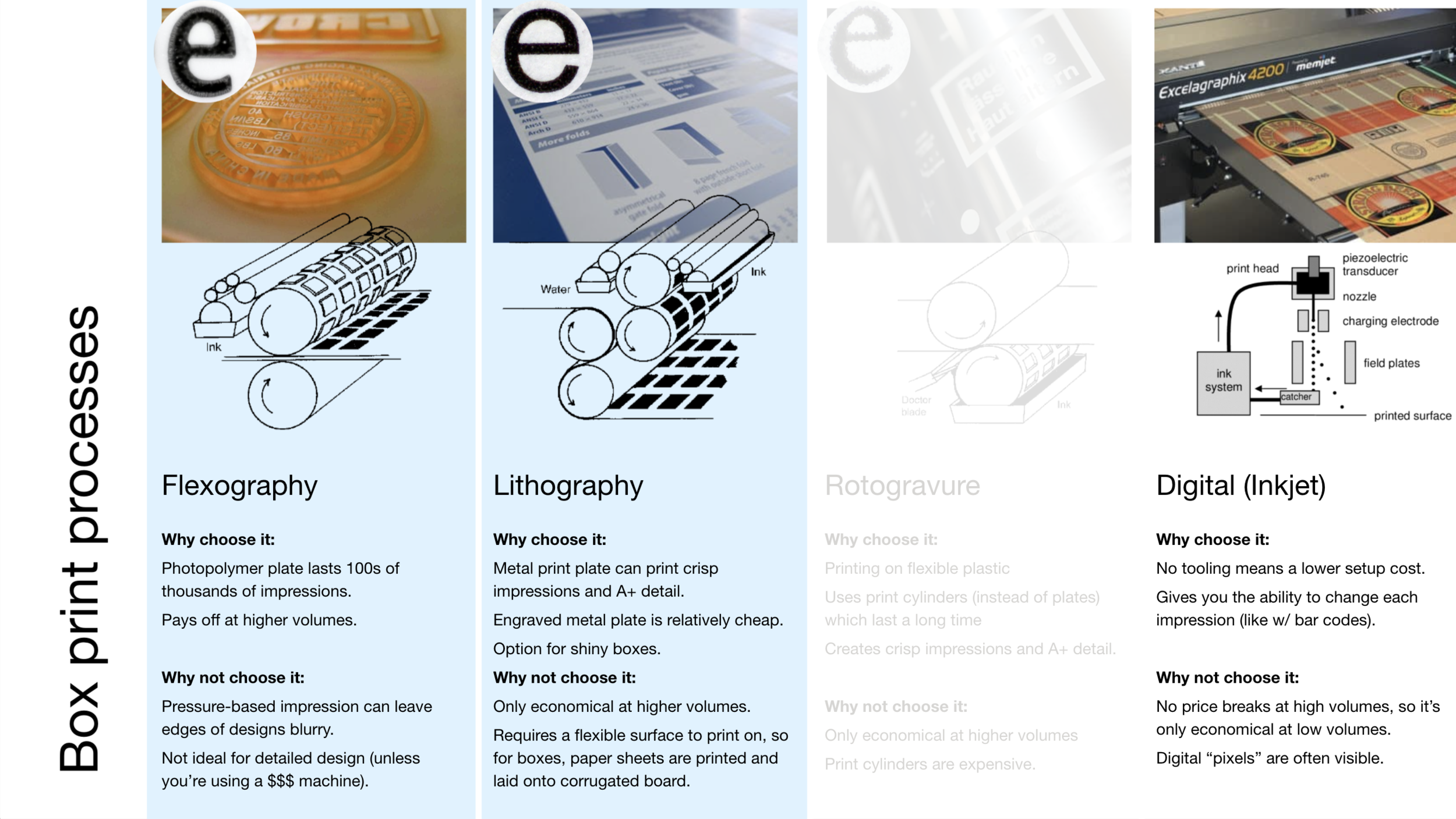
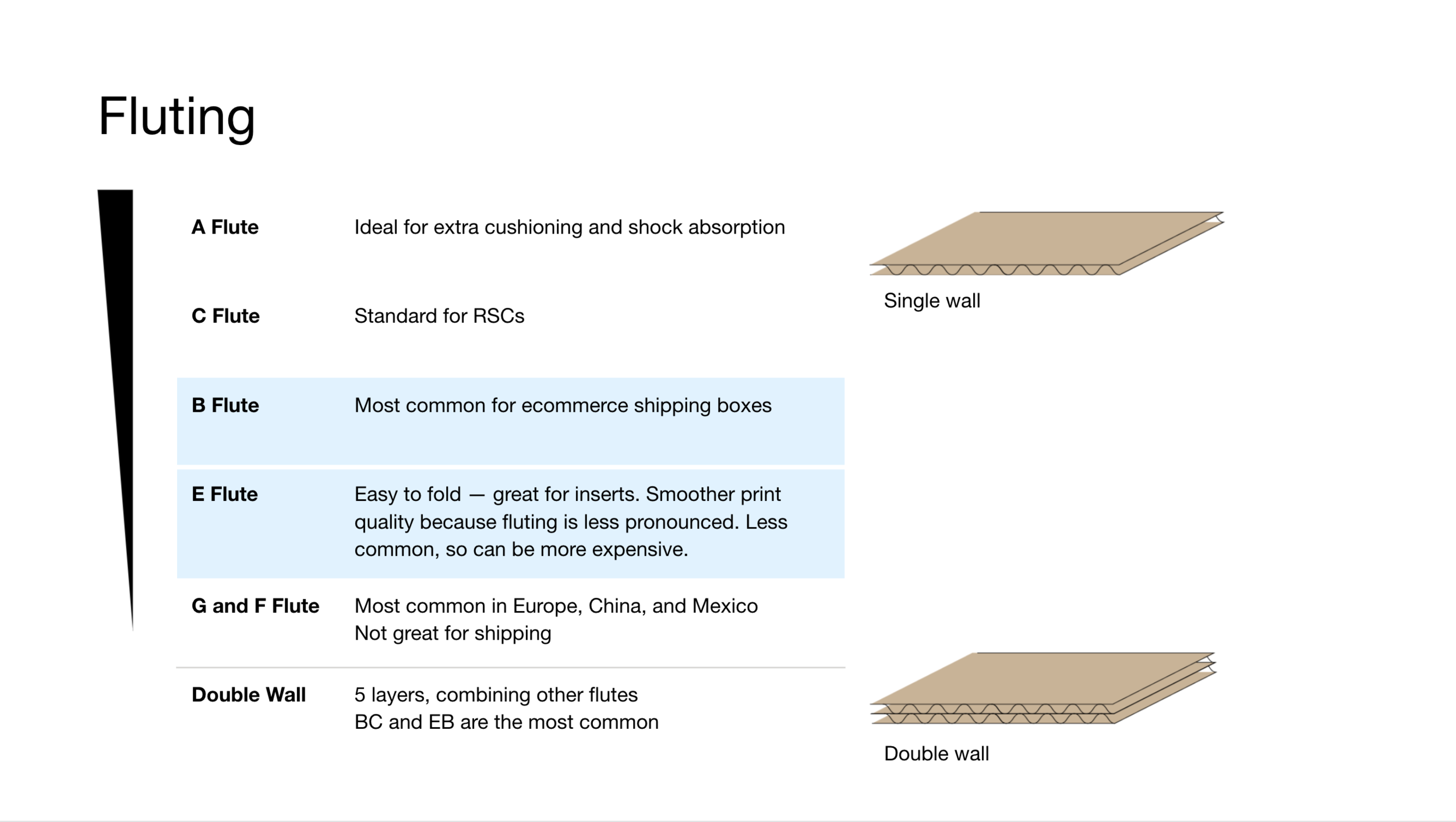
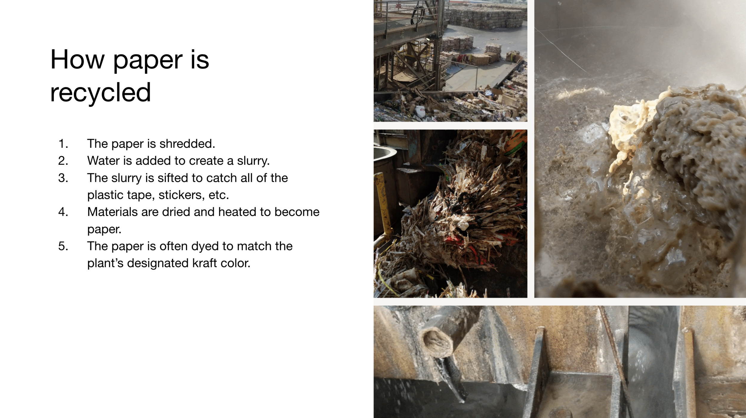
By templatizing each section of the lesson, we leaned on consistency as a strategy. Ultimately, the sections were divided by product type: boxes, mailers, tape, etc. Each product section covered styles, materials, printing processes, manufacturing, recovery, and sustainability.
-
Over time, Lumi U saw many iterations, adapting to more frequent hiring, new product categories, more advanced customer knowledge, and remote work.
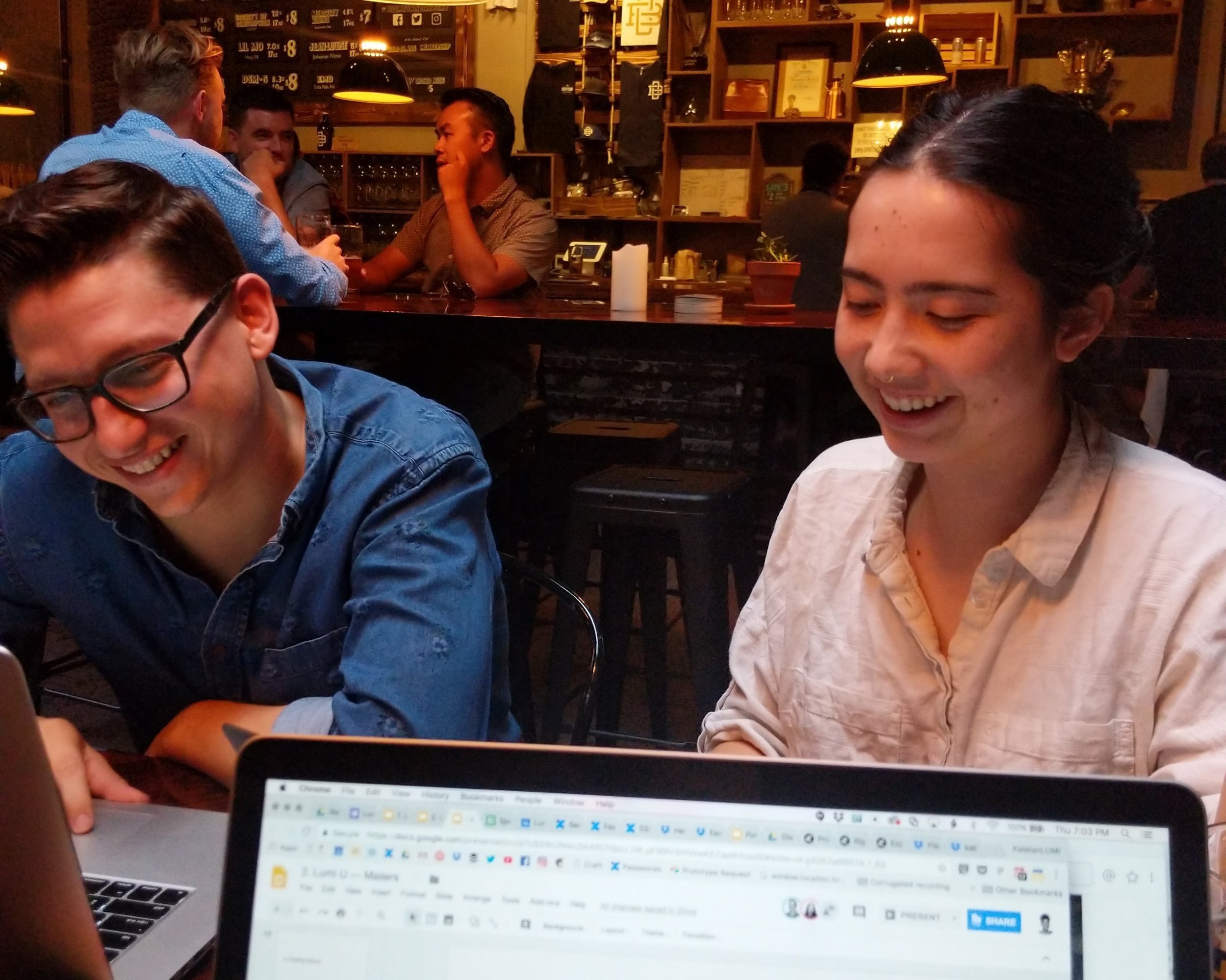
The first iteration was a 100+ slide deck (complete with hands-on activities) that we collaborated on through several meetings and after-hours brewery work sessions. Each Lumi U course consisted of two 2.5 hour sessions. But after two days of teaching, it wasn’t just the teachers who were exhausted — the students were too.
It wasn’t easy, but we soon cut the training in half, ruthlessly (at times painfully) eliminating slides. It forced us to examine each section of information through the lens of various roles. Why would a person need to know this and how would they use this information? Through that lens, we were able to remove information about less popular products and print methods and prioritize more in depth knowledge about more common products.
After each Lumi U session, we gathered feedback from the teachers and updated the deck with new information based on questions they were asked or their own suggestions of how to streamline.
More projects
Sustainable Supplier Guide
A sustainable packaging supplier guide, redesigned for consistency, more robust guidance, and SEO.
PROJECT MANAGER • ART DIRECTOR • WRITER
Opportunity
The Guacamole Airplane Supplier Guide is one of the main ways that clients’ discover the studio online. The supplier directory spotlights dozens of sustainable packaging suppliers that are manufacturing materials like plant-based plastic film alternatives, mushroom foam, and paper made from hemp waste.
The team wanted to give the Supplier Guide a face lift and make it easier to browse.
Execution
From the start, a few goals of the new supplier guide design were to make the individual supplier pages more consistent, increase SEO potential, and make it easier to browse.
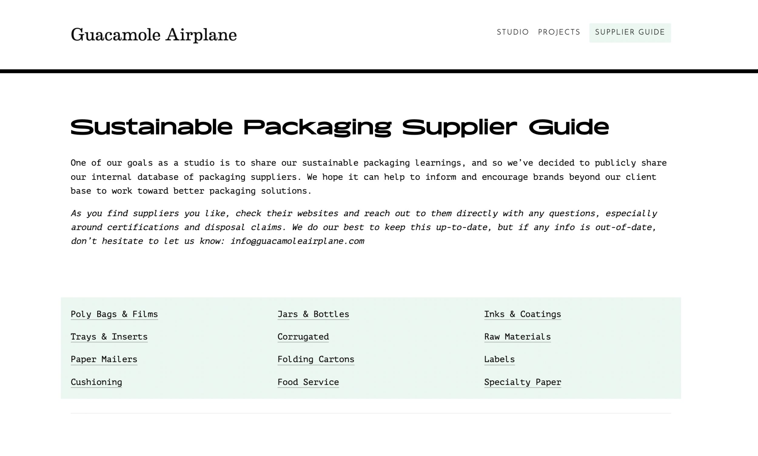
Many suppliers don’t have high quality photography, so one of the first things I did was make the index page less reliant on imagery. The clickable categories up top also make the index page easier to navigate without too much scrolling.
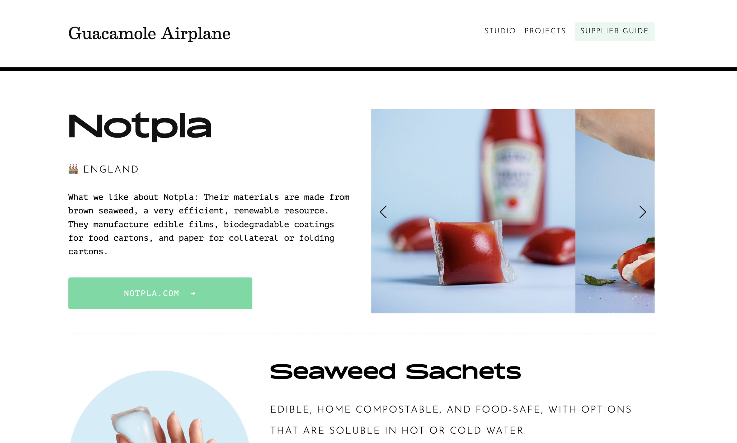
Guacamole Airplane has met with many of the suppliers in the directory, so they have a unique, first hand take on what makes them great. So we added a “What we like about” section on the top of each page where the team can offer personal insight.
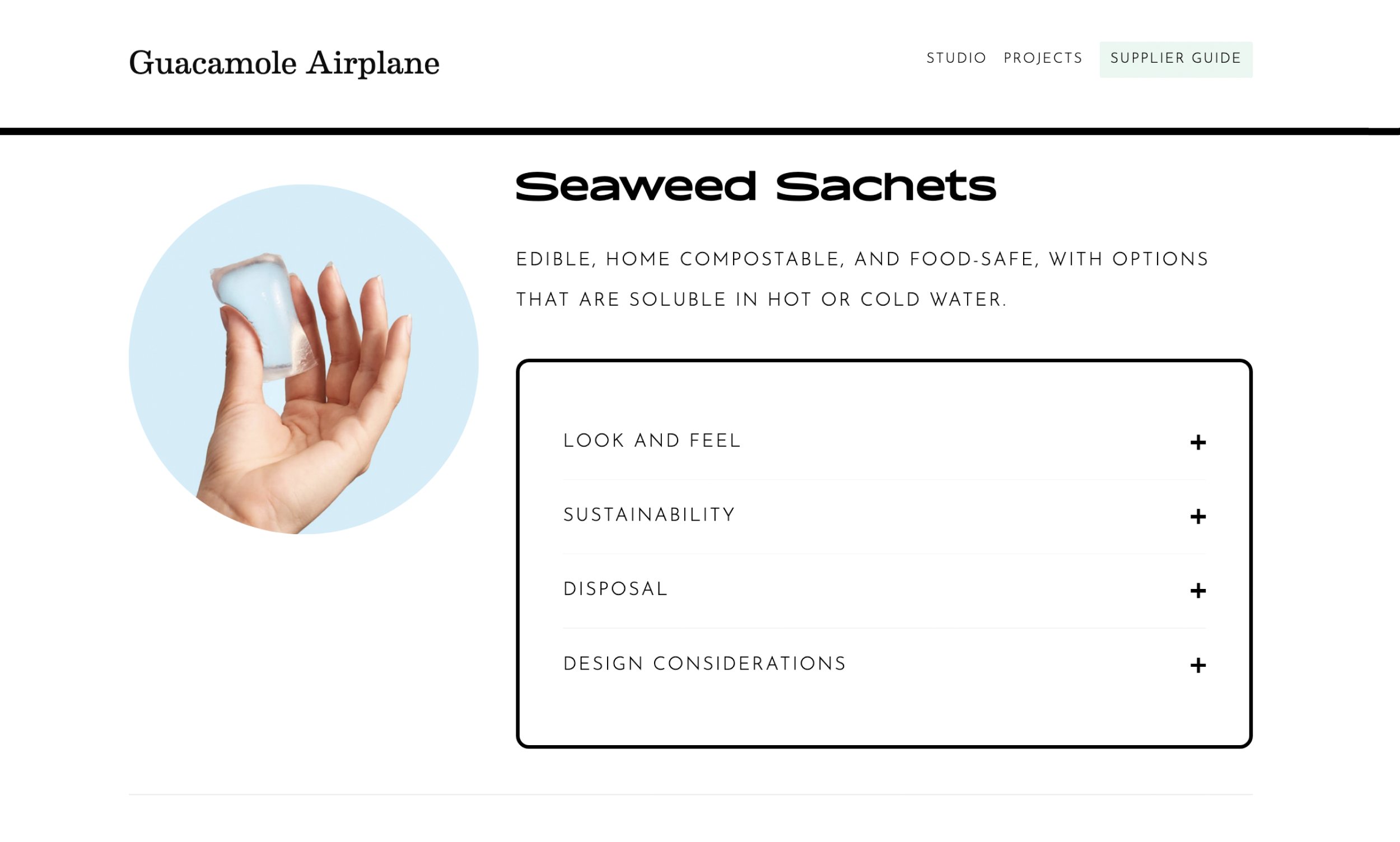
The biggest addition to the individual supplier pages was product blocks. A lot of the products are made from new materials that folks may not be familiar with. These product blocks give Guacamole Airplane the opportunity to offer some education and guidance about what to consider.
Process
-
I brought Guacamole Airplane’s supplier spreadsheet into Airtable to better segment and scale the data. A big part of this was deciding how to consistently name product. We decided on “material + structure” format.
-
With dozens of supplier pages to create, the design had to be completely dialed in before we started populating the guide. I tried different information hierarchies to dial in a design that would scale to suite all suppliers.
-
Finally, we got down to business, dividing and tackling each section to populate each supplier’s page. I templatized copy where possible. For example, sustainability and disposal information is the same for most paper-based boxes. But the films category was much more nuanced since there are so many different source materials and certifications in play.
More projects


